When you see a black turtleneck, you probably think of Steve Jobs.
He wore one day in and day out for years. And he wasn’t the only highly successful, highly productive person to do that. Mark Zuckerberg has his gray t-shirt. Jensen Huang at Nvidia has his leather jacket.
Most high-level folks who dress the same way every day do it for one reason: they want to reduce unimportant decisions so they can focus on the ones that actually matter.
They’re overseeing millions and billions of dollars. They’re leading thousands of employees. Their decisions ripple through markets. So taking one tiny decision off their plate — even something like choosing a shirt — removes friction from their day.
And I want you to apply that same idea to your charts.
Reduce Friction in Your Charting
Years ago, I started simplifying my own charting style in ways that made analysis faster and interpretation cleaner.
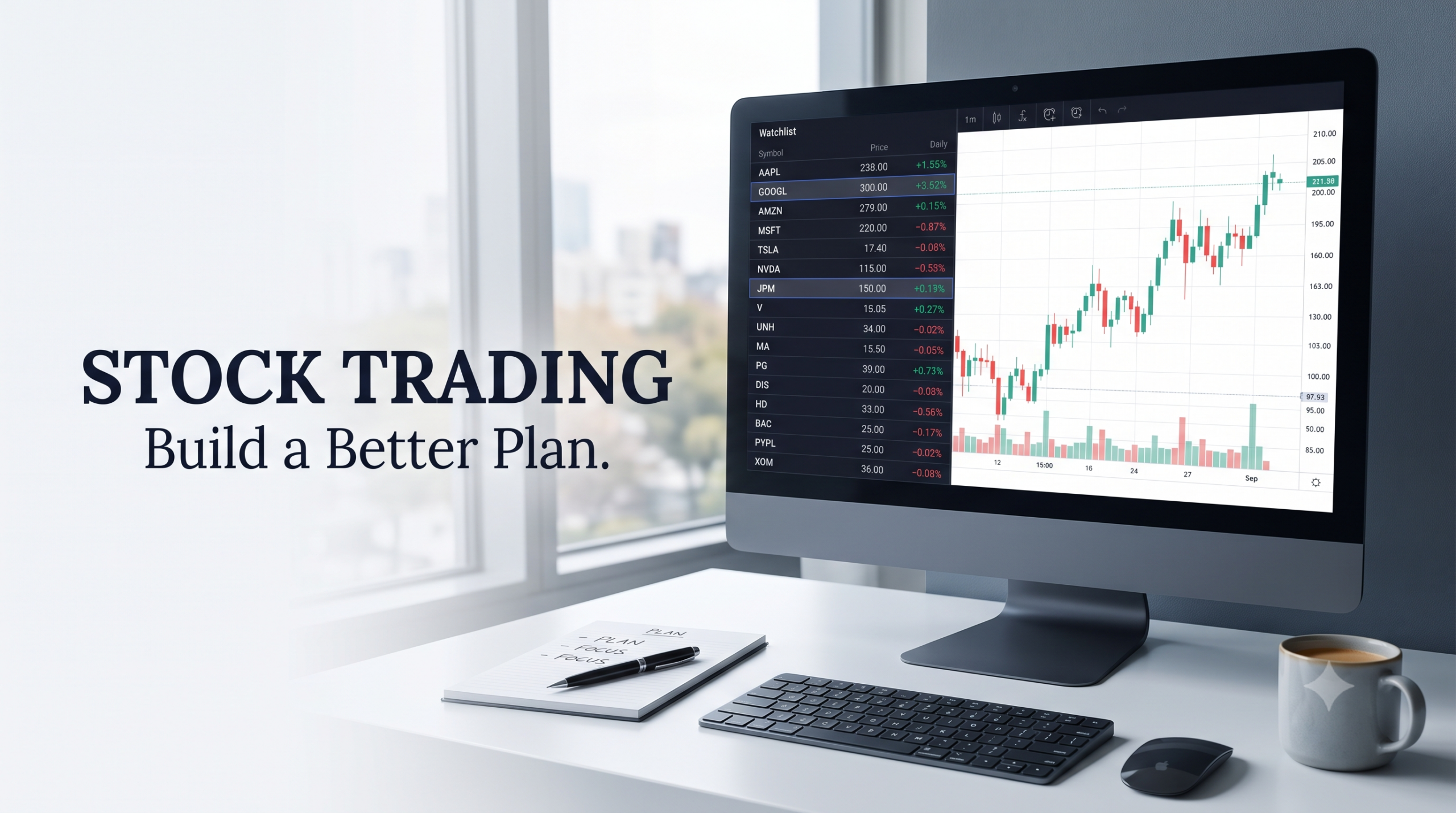
If you annotate your charts at all — especially if you use horizontal lines for support and resistance — you probably default to whatever the software sets for you. Usually a black line. Nothing special.
But what if you assigned consistent colors instead?
For me:
- I use royal blue for resistance.
- I use magenta (hot pink) for support.
I don’t even remember when I picked those colors — I just know I liked the contrast against the red and green candlesticks.
And because I always mark support and resistance with those shades, I never have to think about what those lines mean when I come back to a chart. Consistency reduces cognitive load.
Apply It Across Your Tools
You can extend this to trend lines too.
Every time you draw a trend line — say a rising one that’s providing support connecting price lows — it can have a designated color. It can match your support color or have its own shade if that tilt matters in your analysis. Same thing for resistance trend lines that slope downward, connecting those lower highs in price.
This one simple idea has expanded into so many parts of how I annotate charts.
For example:
- When I identify Gann directional drives, I use thick transparent orange line segments.
- When I share forecasts with our Tribe, I use purple intersecting lines.
- When I’m doing the deep-dive forecasting I teach inside Lost Forecasting, I use specific colors based on the type of cycle I’m measuring.
These colors aren’t random. They tell me exactly what I’m looking at before I even have to think.
Color coding turns interpretation into recognition — which is much faster.
Make It Easy to Repeat
To make this even smoother, I created a “reference” workspace in TradeStation.
Inside that workspace, I keep one version of each annotation — support, resistance, trend lines, Gann work, forecasting lines — all with the exact colors and thicknesses I want.
That way I don’t have to recreate anything. I don’t have to re-edit colors. I just pull what I need from the reference workspace, click Set as Default, and everything is ready to go.
Then when I switch to the actual chart I’m analyzing, I can just rinse and repeat. No friction. No wasted clicks. No mental bandwidth spent on something that isn’t the actual trading decision.
Set your tools up once so your future self can move faster.
Why This Matters
We already have enough decisions to make as traders.
So wherever you can apply this “black turtleneck theory,” do it. Simplify. Standardize. Reduce friction.
You’ll speed up your analysis. You’ll interpret charts more cleanly. And over time, that consistency supports better trading results.
Because the fewer micro-decisions you spend energy on, the more energy you have for the decisions that actually move your performance forward.
~Hima

Leave a Reply