It’s a very happening Friday.
The broad markets opened lower — tech stocks were dragging everything down — and yet by midday, we were already bouncing. Moments like this are the perfect time to zoom out.
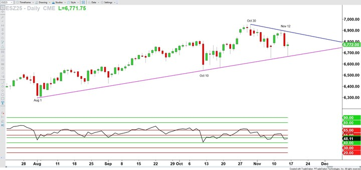
For me, that means looking at the E-mini S&P 500 futures, which you see pictured here. Today’s action is still unfolding, but it’s already showing a dramatic range.
The Drop Looked Endless… Until It Didn’t
Early this morning, if you just glanced at the market before the open, it looked like the drop had no end in sight.
But look closer.
Price actually held just short of a rising pink trend line — the one connecting the August 1 and October 10 lows — and that same line was reinforced again on October 17 and November 7. That’s meaningful.
Trend lines, at their core, are simply rising or falling support or resistance levels.
That’s why I draw this one in pink, just like any other support.
Trend Lines Have a Shelf Life
Here’s the thing about trend lines: they have a shelf life..
They’re only useful while they stay intact.
We never know with certainty when one will break, but as long as they’re respected, they can act like guardrails — even when price feels choppy or unruly.
We’re seeing the same idea on the upside.
The October 30 high lines up with the November 12 high, and yesterday’s action (November 13) confirmed that short-term resistance trend line.
Shorter-term, yes. But still useful.
A Lot Is Happening in the World — and the Market Knows It
The government has finally reopened.
But some economic data may never release because of the extended shutdown.
The Fed meets again in December, and what once felt like a “guaranteed” rate hike now feels uncertain — and uncertainty makes some investors nervous.
And of course, we’re heading into the holiday season, where retailer activity alone can create extra volatility. It’s a busy, emotional stretch of the calendar for markets.
Why Multiple Time Frames Matter
With everything moving so quickly, one of the best ways to stay grounded in your analysis is to avoid relying on just a single time frame.
A daily chart gives you a useful view — but it’s not the full picture.
So if you draw a trend line on the daily, make sure you also look one time frame higher. In my case, that’s the weekly. And then drop down to one lower — for me, usually the 60-minute chart, but any intraday view works.
The same principle holds for any trend line you draw on any chart.
You always want context from the larger trend and clarity from the smaller moves inside it.
What’s Next?
We’ll need a couple of days to see which direction the market wants to resolve from this converging pattern — a falling trend line above and a rising trend line below.
But the process you use — zooming out, drawing your levels, checking multiple time frames — will help you whether this pattern breaks next week or shows up again months from now.
~Hima

Leave a Reply